|
1. Find 3 examples of posters or paintings that Alphonse Mucha created. Copy/paste your favorite into your comment here. 2. Compare what you saw to the illustration from contemporary artist, Karen Hallion, below. What do you see that is similar or the same? What is different? 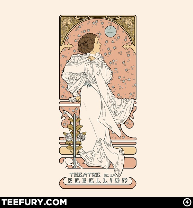
Gavin Hawthorne
12/3/2013 03:21:43 am
There is some sort of arcing shape going on in the background. there is a lot of small details like the stars in the picture above and the flowers and other various items in both artists pictures. 12/3/2013 03:21:58 am
http://www.saleoilpaintings.com/paintings-image/alphonse-maria-mucha/alphonse-maria-mucha-job-79887.jpg
samatha
12/3/2013 03:24:38 am
texture, contrast 12/3/2013 03:24:32 am
Both of the artists have a very similar style and use similar elements such as color, and repetition with a color. Alphonse seems to use more brighter colors than the piece above however.
Julion Oddy
12/3/2013 03:26:01 am
http://www.bpib.com/illustrat/mucha5.jpg 12/3/2013 03:26:40 am
http://4.bp.blogspot.com/_HKpa9mzsTsQ/TO1UlPQRpMI/AAAAAAAAAwU/mP5g-JsVxMM/s640/Aphonse.jpg 12/3/2013 03:27:24 am
i think the way the artists use the arkway, pattern design. or how the women are drawn the shape looks similar. the thing that's different is Alphonse Mucha uses a lot more detail. 12/3/2013 03:29:42 am
similar: unity of colors,
Mikkel
12/3/2013 03:30:59 am
1.http://upload.wikimedia.org/wikipedia/commons/4/44/Alphonse_Mucha_-_Donna_Orechini.png
asher murphy
12/3/2013 03:34:26 am
1.Color
Matthias A.
12/3/2013 04:20:23 am
1.http://upload.wikimedia.org/wikipedia/commons/8/87/Alfons_Mucha_-_1896_-_Summer.jpg
http://uploads5.wikipaintings.org/images/alphonse-mucha/the-trappistine-1897.jpg 12/3/2013 04:23:15 am
http://en.wikipedia.org/wiki/File:Alphonse_Mucha_-_Cycles_Perfecta.jpg 12/3/2013 04:23:25 am
they use the same colors, the same feeling in the pictures, and they use the relatively same technique to draw the girls.
Mchael Tran
12/3/2013 04:27:52 am
http://fc00.deviantart.net/fs70/o/2011/241/5/e/5e885d64dc8fccef0e24e6923e45a3d9.jpg 12/3/2013 04:28:51 am
I don't know how to explain it but they have similar styles, the way they make their background to catch the eye of the person looking at it. They also use a type of pattern or rhythm in the background that is kinda hypnotizing, when you look at it too long it feels like your in a trans. 12/3/2013 04:28:59 am
12/3/2013 04:30:59 am
my first favorite piece of art by mucha is on my website shortcut and my other two favorite pieces by mucha would have to be on.
Roberto Carlos Luna
12/3/2013 04:32:23 am
http://images.fineartamerica.com/images-medium-large/my-study-of-an-alphonse-mucha-moon-elena-yakubovich-elena-yakubovich.jpg 12/3/2013 04:33:07 am
Bold outlines, paler colors and other things that are abstract/weird.
trevor wagner
12/3/2013 04:33:23 am
they all have big outline around the people
Mikey
12/3/2013 04:37:58 am
Forgot to write similarities... They both have women as the focus and are at the center.
kyle kozisek
12/3/2013 04:34:32 am
http://www.1stforprint.co.uk/ebaylistings/Mucha/AAM074_preview.jpg
Russ Q
12/3/2013 04:53:27 am
http://upload.wikimedia.org/wikipedia/commons/e/e9/Four_Seasons_by_Alfons_Mucha,_circa_1895.jpg 12/4/2013 03:22:57 am
It has the same kind of portrait feel that most of Alphonse's pieces have. It's of a woman wearing a long flowing dress with lots of attention to detail much like most of his. Karen's illustration doesn't use such an intense color palette, though.
Colby
12/16/2013 03:19:06 am
There is some kid arcing shape in the background. there is a lot of small details like the stars in the picture above and the flowers and other various items in both artists pictures. 1/6/2014 11:55:25 am
you can tell that there is some big thing going to happen but there isn't as much color as there should be Comments are closed.
|
Ms.TompkinsTeacher at EHS in Vancouver, WA. Drawing, Art Studio, Graphic Design and Yearbook. Archives
January 2014
|
 RSS Feed