 LINE: is an element of art/design. It's a "continuous mark" across a surface. Today I'd like you to pick one of the options below:
a) leave a comment here listing at least 10 different kinds of line that you could make on a piece of paper, or in photoshop. or.... b) create a small document in photoshop showing me 10 different types of line, upload to flickr, and leave the link here. Your choice. Every Friday, I'll provide a list of things to draw or the option of drawing whatever you like. You can choose either option.
Today we'll go through the turn in process together. 1. Create a document in Photoshop, 5x5" 2. Draw! 3. Save as a JPG file, with today's date (example: "Draw9-13-13.jpg") 4. Log in to Flickr. 5. Upload your drawing. 6. Post the link here! The last concept we talked about was PROXIMITY. This is the toughest one. Proximity is both how you organize and prioritize information in your layout. So.... let's say you are building a business card for me. This is something I'll hand out to other teachers, business people, or anyone else I meet and need to stay in contact with. What do you think the order of importance is out of this information.... copy the following information and put it in a list that has the MOST important info at the top, and the LEAST important at the bottom. Don't copy anyone else's answer. Think about this question.
my blog, my cell number, the address of the school, my name, my job title, the school I work at, my email address, my classroom phone number, DESIGN GOAL: Students will create a beautiful set of abstract shapes, focusing on letterforms, and positive/negative space balance. TECHNICAL GOAL: Students will learn how to manipulate image placement and tools in Adobe InDesign. REQUIREMENTS:
 Another design concept we talked about recently was CONTRAST. At it's most simple, contrast = opposites. I'm going to list a few ideas/things here. Give me something that contrasts with each one. I'm looking for as many ideas as possible. Don't just copy the first guy to answer. There's more than one answer, and no answer will be the perfect, "correct" answer. Think, think, think.... be creative. What else could contrast?
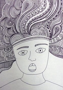
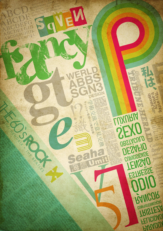
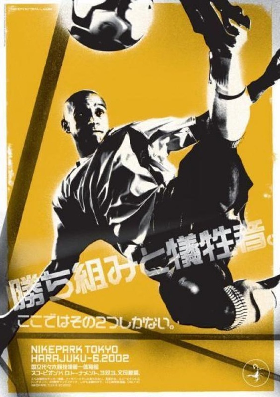
1. Mt. Hood 2. Batman 3. Jay-Z 4. soccer 5. Home Alone II (the movie) Let's talk about REPETITION. You read about it last week. Repetition is repeating elements. It's can be repeats of anything in a piece, anything at all... The repetition of elements helps to unify a piece. It can make it seem more whole, more cohesive, more well thought out. Look at these pieces. Choose one, name it (caption below when you click on an image). Find as many repeating elements as you can. List them in your comment. Be sure to describe them thoroughly so we can understand what you're looking at.
We can also center text across a space. This is usually reserved for formal invitations, like wedding announcements. But there is one more kind of text alignment to talk about. It's usually found in newspapers, but not many other places. It's kind of hard to work with, because it can easily look bad. It can look chunky, and awkward, and the spaces between words can form what is called a river of white space, which can be distracting to the eye. You'll usually see that more in very large chunks of text across a page. It might be hard to see it here, because I'm not writing enough. But I'm running out of things to say so you can see this particular alignment options. I supposed I could tell you long stories, but I'm think I'm getting pretty close to more than five lines of text. That should do. Can you see what the text is doing differently in this paragraph? For your comment today, find out what this last type of alignment is called.
It's Friday Free Draw day. Today I want you to draw any two items that CONTRAST.
5x5" Photoshop document, saved as jpg, uploaded to Flickr, link left in the comments here. I liked your answers yesterday. Remember, we want to be able to really talk about a piece. So, more than one sentence is needed to really get at the interesting stuff. Most folks had really complete and complex thoughts they put down. Nice job. TODAY! I have two things I'd like you to do here. 1. We looked at the Elements and Principles of Design/Art early this week. There are two Principles that I didn't include in our worksheet. Figure out what they are, and list them here with a brief description as you understand them currently. 2. I'd like you to look at these pieces, pick one, name it, and talk about what you see, using the vocab from the E & P (elements and principles), and anything you learned yesterday in your reading. Not all the elements nor all the principles may be used in every single piece of art. But, they'll certainly contain a lot of them.
 soooo ugly! soooo ugly! Turn in late tiles, here, too.
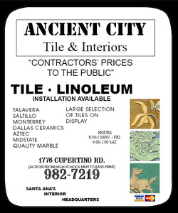
I will get an email telling me you've submitted a comment, and will grade it at that point. Using what you've learned about the Principles & Elements, and the four design principles we've talked about this week.... redesign this Tile Company advertisement. Your customer (the tile company owner) is willing to pay for a full color ad, in either a 3x2" or a 3x3" size. The ad will be printed, so it needs to be at least 150 dpi/ppi. The owners is asking that the following information is included: Ancient City Tile & Interiors 1776 Cupertino Rd. Santa Ana, Ca 951-982-7219 Hours: 8:30AM - 5PM, Mon-Fri. 9AM-1PM, Sat. Installation Available Optional Information to Include: Any of the other items from the old ad. Photos of Tiles Your customer wants this ad to go into Wednesday's paper, so it needs to be complete by the end of Tuesday, Sept 24. So, I'm gone again. I'm so sorry. I had another meeting in the morning, and forgot today was a half day. My apologies. There are two parts today's work: some reading and then some questions.. These are concepts I'd like you to know (and love) in the readings. We're going to take these concepts and use them in some design work. Be prepared to talk about these ideas tomorrow.
When you are done reading your section (and yes, you can read the other sections if you like).... Look at this advertisement for a tile and flooring company. It's awful. It's poorly designed, it's hard to use, it's unpleasant to look at, and it doesn't do it's job well. What are the specific design problems with this phone book ad? Make a list of the problems and solutions, and leave a comment here.
We'll be finishing up our Principles & Elements of Art project today.
WARM UP TODAY! I have a meeting I had to go attend. I'm sorry I'm not here. I'll be back tomorrow, promise. Your warm up will be your critique today. When you are working on this, remember... Critiques are always POSITIVE, creative criticism. The goal is to help people improve their skills. We are not being harsh, we are not being too easy. Find things to help them improve on, and give suggestions on how to do so. Go look at the magazine covers that your classmates have turn in to the group pool on Flickr. Choose one of the covers. Try not to choose one a lot of other people have commented on. Leave a comment here answering the following questions. Use proper spelling and grammar.
NEW ASSIGNMENT
 Upload your finished Principles & Elements of Art/Design worksheet to Flickr, and post the link here by the end of Tuesday, September 17th.
Every Friday, I'll provide a list of things to draw or the option of drawing whatever you like. You can choose either option.
Today we'll go through the turn in process together. 1. Create a document in Photoshop, 5x5" 2. Draw! 3. Save as a JPG file, with today's date (example: "Draw9-13-13.jpg") 4. Log in to Flickr. 5. Upload your drawing. 6. I'll show you how to get the weblink from your image, or you can figure it out on your own. :) 7. We'll post the link here, with your name. Put the link in the "website" field in the comments. Every week, we'll look closer at one of the Principles & Elements of Design. Tell me (in your own words) what your definition of LINE would be. After typing that up... go check out these examples:
Click Here  Symbols are a huge part of design. Symbols are a huge part of design. We'll be investigating various art genres, styles or time periods this term, too. CLICK HERE and look for the terms below. Give me an explanation, in your own words, for what this author means for each the terms:
1. Pictograms 2. Rebus 3. Phonograms 4. Ideograms Remember to attempt a Flickr account if you weren't successful yesterday. If you have a late magazine cover, turn in the link here. I will get an email telling me you've submitted a comment, and will grade it at that point. Assignment: You Magazine Cover Due Date: Friday, Sept 13 Requirements:
Turn in work here, via Flickr, in class. Critique after, in class.  FLICKR:
This is where I'm going to have you upload your work. All of your visual assignments, Friday work and large work, will be turned in via Flickr. Flickr doesn't belong to the school or the district, and is a free, publicly available website for amateur and professional photographers. You can choose how visible (or not) you want your information and images to be. I just need to be able to access your work for grading, and your classmates will need to see your work for critiques. Behave responsibly, and show some respect while you participate in this community. 1) Please go to Flickr (there's a link at the right), and create an account. Don't lose your account info! I won't be able to help you find it again. Write it down, or type it up somewhere, or use information you won't forget. 2) I've created a group for design work on Flickr. You can find me (ms-tompkins) on Flickr. Please request to join this group (ehs-tompkins-digital), so we can see each other's work. 3) Leave a comment here telling me what your username is on Flickr. We'll be discussing Typography as a method of visual communication throughout the term. Tell me what you know about the word: SERIF. What does it mean? What does it look like? It's ok if you don't have a perfect answer today, or if you don't know. Just tell me what you do know about SERIFS. I want to know what you know right now.... (not what the internet can tell me. I can do that myself, thanks.).
Our first day together we watched a few videos about what graphic design means. Leave a comment here, in your own words, telling me what you understand about graphic design. (If you missed day 1, tell me your best guess.) Remember to check your spelling & use whole sentences. Welcome to graphic design 1! We will be using this blog to discuss our work, turn in projects, practice information and generally communicate. I expect everyone to behave in an adult, civilized manner. If I see comments left that do not meet my standards, I will delete them immediately and have a conversation with the author, with possible repercussions depending on the tone of the comment. In short, be cool. Don't be a jerk. Directions for today... Look at the top of the website. If you hover over the word "graphic design" you will see a syllabus link appear. Open this syllabus page, and please read. When you are done reading, please leave a comment here using your first name and last initial (you don't need your full name), and tell me what my three rules are, and how much daily/participation work is worth. We'll check and make sure everyone has been able to complete this today. This comment format is something we'll do every day. You may want to bookmark my website, save a shortcut or email/text yourself the web address for the future. You can also access this site from home, if need be.  |
Ms.TompkinsTeacher at EHS in Vancouver, WA. Drawing, Art Studio, Graphic Design and Yearbook. Archives
January 2014
|


 RSS Feed