|
Today is the last day of the month! Please check back through the prompts for October, and make sure you've completed each one. I'll be closing all the October prompts over the weekend, and adding up totals for grades.
In the spirit of the day... tell me, what was your favorite Halloween costume as a child? What type of music does your band play? What kind of feeling should your font choices have to match your music?
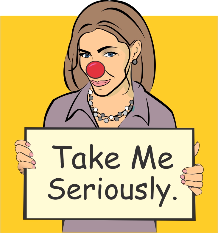
We talked about Comic Sans yesterday. We discussed how many people use it incorrectly. There are a few other fonts that get used over and over, for the wrong type of messages. Take a look at these three (Comic Sans, Trajan and Papyrus). What style does each remind you of? What kind of product or message could you use these for that would actually fit the font? 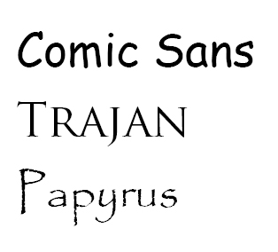 Let's talk typography. One of the skills we need to have as designers, is a sense of what font choices work appropriately for which projects. We also need to know a little about contemporary design thought regarding typography. If we are creating a safety sign for a welding shop, we don't want to use a light, fluffy, silly font style. We'd want to use something easily readable and fairly straightforward. We want people to take the sign seriously, but be able to read it quickly from afar. Safety is serious business. If we are creating a sign for a children's talent show... we can go crazy, and choose something silly, something colorful, something that maybe doesn't need to have the same readability level. One of the problems with how accessible and numerous fonts are now is that people will design signage, or projects, without putting any thought towards the goal or purpose of their project. They don't make font choices that match their project. On of the biggest offenders is Comic Sans. People use it for everything. It was meant for comics, in the early 1990s. It's dated and overused. I bet, if you looked around our school closely you'd find signs or posters using Comic Sans.
Look through the fonts available to use here in 515. Tell me what you think the best choices would be for the following:
1. a metal band poster 2. a donation letter from our DECA (business) club 3. a safety sign in the shop class DESIGN GOAL: Students will create an album cover for an imaginary band. It will have the band name, an album name and at least one photo included. Album covers will be tidy, spelled correctly and well-designed, using the principles & elements of design. TECHNICAL GOAL: Students will show proficiency with the text tool and the photo place tools. REQUIREMENTS: You'll be creating some album art for a fictional band. I have the process for discovering your band and album name below, as well as a piece of art the "band" has requested you include.
Step 1: Open a document (InDesign, Photoshop, anything to take notes). Step 2: Click here, go to the left side and look for the "Random Article" link. Click it to get your randomly generated band name. Write it down, type it up... don't lose it. Step 3: Click here go to the left side and look for the "Random Article" link. Click it to get your randomly generated album name. Write it down, type it up... don't lose it. Step 4: Click here and find a photo from a person who's user name starts with the same letter as your first name.  It's Friday Free Draw Day! Be sure to grab a tablet and pen if you like. Check the link below for ideas, if you need help thinking of what to draw.
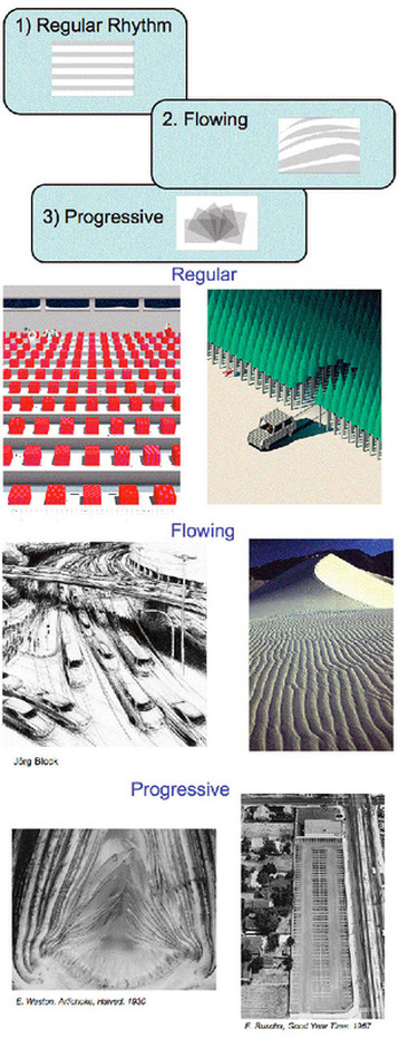
Here's a list of things to draw or the option of drawing whatever you like. You can choose either option. Today we'll go through the turn in process together. 1. Create a document in Photoshop, 5x5" 2. Draw! 3. Save as a JPG file, with today's date (example: "Draw9-13-13.jpg") 4. Log in to Flickr. 5. Upload your drawing One of the last Principles of Design we need to discuss is Rhythm. Rhythm is similar to pattern, but where pattern is the same exact repeated elements, over and over.... rhythm can have some change in the pattern. Think about it like drum beats or a bassline in music. The same elements will repeat, but it won't always be the exact same pattern. There will be chord changes or occasionally different beats interspersed in the song. 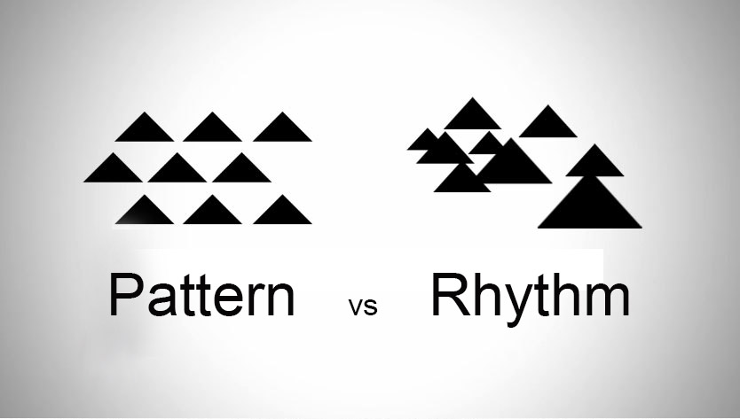 There are a lot of ways to use Rhythm in a piece, whether it's a painting, a drawing or a commercial piece for a client.
After reading and looking at the examples here.... go find a visual example of Rhythm, and paste the link here. Describe what the rhythm is and how the elements are producing a rhythm.
Movement can be a tricky Principle of Design to describe. Look at the following examples. See how the different elements of art direct your eye to a particular place in each piece? It's not actual movement, like an animation, but rather the impression of movement and flow between colors, shapes, elements, etc. Choose one of the pieces, name it, and describe (with as much detail as possible) what the movement looks like in that piece.
Pattern is another Principle of Design that we need to be able to recognize and discuss. Find an example of your favorite pattern on the web. Post the link here.
Balance is one of our Principles of Design. We can divide that in two halves: Symmetrical and Asymmetrical. Both are useful, for different purposes. Go to the interwebs and find me examples of both. Paste links into your comments, and make sure to label which one is which, like so....
asymmetrical: http://www.websitewithstuff.com/painting/asym.html symmetrical: http://www.websitewithstuff.com/drawing/symm.html It's Friday Free Draw Day! Be sure to grab a tablet and pen if you like. Check the link below for ideas, if you need help thinking of what to draw.
Here's a list of things to draw or the option of drawing whatever you like. You can choose either option. Today we'll go through the turn in process together. 1. Create a document in Photoshop, 5x5" 2. Draw! 3. Save as a JPG file, with today's date (example: "Draw9-13-13.jpg") 4. Log in to Flickr. 5. Upload your drawing 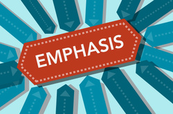 Emphasis is a principle of art which occurs any time an element of a piece is given dominance by the artist. In other words, the artist makes part of the work stand out, in order to draw the viewer's eye there first. There are a lot of ways to create emphasis.
In your comments today, Go find a piece of design or art that uses emphasis clearly. Paste a link, and tell me what part is being emphasized and HOW. What did the artist do? I'm out at a meeting today, so you have a sub. Please continue working on your Knots & More Vector drawings. Remember, focus on the details, include those curves. Fewer points is better. 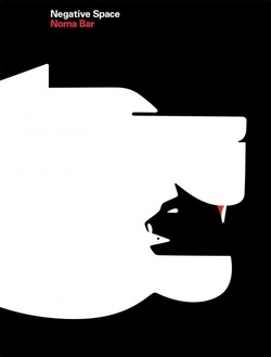 Negative Space is the left over areas in a design or drawing. It's also called the WHITE SPACE commonly, because it's the paper surrounding the image or text.
In this image, Noma Bar (a current designer) has used the negative space to create a double image. Noma Bar is creating work, right now, for several very famous magazines and clients. Check out this interview and more of his work by clicking here. In the comments today, tell me what creature you saw first in this image. In your own words, tell me what the difference between VALUE and COLOR is...
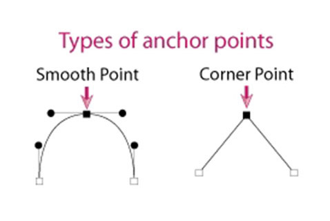
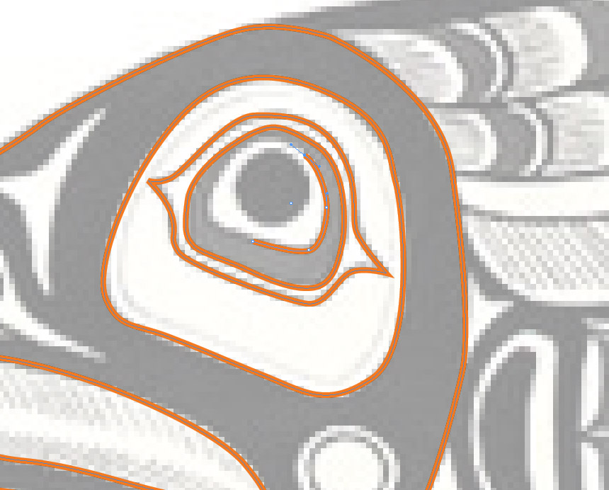
Knots & More (Vector Art) Due: October 24th (end of class) Choose one of the images from the groupshare folder titled, "Knots & More" Choose between Mayan art (southern and central America), Maori (New Zealand), Haida (Pacific NW Tribes) and Celtic (Ireland) designs. File> Place the image into InDesign and lock it down if that helps you. Use the Pen tool to create a detailed replica of the piece. Color it as you like. Export as a JPG and upload to Flickr. Post the link here.
Go look up the word TEXTURE in Google Image Search. Paste a link to your favorite here, and use at least three words to describe it in detail.
 Go to the interwebs! Find an image that uses ANALAGOUS colors. Post a link to the image here, and tell me what the two ANALAGOUS are.
 Go to the interwebs! Find an image that uses COMPLEMENTARY colors. \
1. Post a link to the image here. 2. Tell me what the two COMPLEMENTS are from your image. Color Theory, part 1
Students will learn how to use Bezier curves, in creating color wheels that show color relationships. DUE: Monday, Oct 14 (end of class) DESIGN GOAL: Students will create a set of color wheels, showing primary, secondary and tertiary colors, as well as color relationships such as complementary and analagous sets. TECHNICAL GOAL: Students will learn how to manipulate Bezier curves to draw shapes. REQUIREMENTS: 1. In Adobe InDesign, use Bezier curves to create either a color wheel. 2. Make sure to label each primary, secondary or tertiary color on the color wheel. 3. On another page, make a copy of your color wheel. Find a way to highlight certain colors to show a complementary relationship. 4. On a third page, make a copy of your color wheel. Find a way to highlight certain colors to show an analagous color relationship. Please read through the following chapters (chapters are listed on the left) on this website: http://www.worqx.com/color/
 We talked a little about color last week... tell me, what are the primary colors? What are the secondary colors? What does CMYK mean? Remember, I want your words, not Wikipedia's words.
Order of business today:
1. Make sure your Abstract Letters in COLOR are uploaded and a link posted to the correct place (see below). 2. Work on your Expressive Words if you aren't quite done yet. I'll ask for them by the end of the period. 3. Friday Free Draw time. 4. Critique of our Abstract Letters in COLOR towards the end of the period. ------------------------------------------------------------------------------------------------------------------------ It's Friday Free Draw Day! Be sure to grab a tablet and pen if you like. Check the link below for ideas, if you need help thinking of what to draw. Here's a list of things to draw or the option of drawing whatever you like. You can choose either option. Today we'll go through the turn in process together. 1. Create a document in Photoshop, 5x5" 2. Draw! 3. Save as a JPG file, with today's date (example: "Draw9-13-13.jpg") 4. Log in to Flickr. 5. Upload your drawing. 6. Post the link here! Use the internet and find your favorite example of WARM colors. Post a link to the image here. Also answer the following: What are the WARM colors? If you don't know... look it up!
Look at the images below. There are two sets. There is a change that is the same for example#1 and set#2. What is the difference between them? (hint: it's an element of art/design) NOTE: Not everyone turned in their COLOR version of the Abstract Letterform project yesterday. Be sure to click Assignments on the right here ----> and find the "abstract letterform, color!" posting to paste your link into.
Please turn in your finished, exported, Expressive Words project here. I will get an email telling me you've submitted a comment, and will grade it at that point. Below is a list of descriptive words, and a list of typefaces. Choose 10 of the words and ONE typeface. Find a way to describe the words using only the word itself. No drawings, no pictures, no color. You can repeat the letterforms as necessary from that particular word. No other typeface may be used. Each typeface may be used in all of its various fonts, including italic, bold, black, outline, etc. You may also stretch, reverse, flop, duplicate, fade and/or otherwise change the typeface in any way that will help to suggest the description you have chosen. We will use Adobe InDesign for this project. The examples at the top of the page show what one can do with Helvetica (Arial) and its relatives to convey a sense of the word’s meaning or intent. Please understand that the assignment has as much to do with what you do to manipulate the individual letter as it has to do with the composition. Look at the examples for ideas. We will be working in 4-inch boxes with a .25 rule around each one. Make as many pages as you need.
|
Ms.TompkinsTeacher at EHS in Vancouver, WA. Drawing, Art Studio, Graphic Design and Yearbook. Archives
January 2014
|


 RSS Feed