|
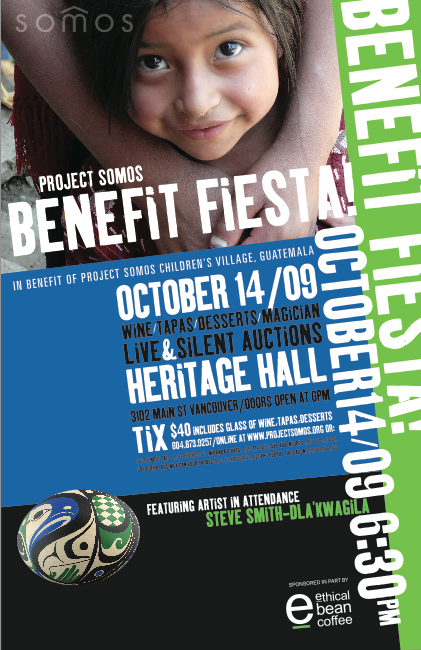
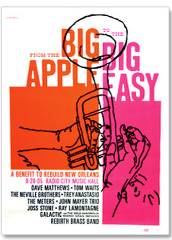
Check out these two non-profit posters. Look how they each are using color. Look at how they are organizing their text. In your comment today, describe (in your own words) how you see colors used in each poster, and describe what they did with the text in each. Watch your spelling and grammar, and be sure to talk about both posters. Example: "In the Benefit Fiesta poster, the designer chose to..... In the Big Apple poster, the designer selected...."
Emme Chadwick
12/4/2013 03:21:28 am
In the big apple poster, I feel like the designer tried to include a lot of bright colors into the poster to really make it pop. To me, the poster look clean, and well organized with a lot of shape and value.
Emme...
12/4/2013 03:23:04 am
also, in the benefit fiesta poster, I feel as if the poster if too messy and all over the place. It has the information, but a lot of random stuff going all around it. It has good contrast and its kinda unique.
asher murphy
12/4/2013 03:23:10 am
all the colors work together to make the poster pop.
jose
12/4/2013 03:23:47 am
they use color as a way to catch you eye cause the color pops out a lot. they did the text really well by using bold fonts and making them pop with the color chooses and it all matches the poster.
Kiona Smith
12/4/2013 03:23:52 am
In the Benefit Fiesta poster, the designer chose to use brighter colors that stood against the background color for more important information. In the Big Apple Poster, it seems to me that the designer did the same thing. The more important info was a color that stood out from the rest, but the less important info was a color that didn't stand out as much. Both posters made the important info pop out more so than the extra details.
samantha brooker
12/4/2013 03:24:29 am
in the first one, they used angelus color relationships.. the second one has really bright colors that stand out.
Noah Gibson
12/4/2013 03:25:17 am
In these two pictures/posters, I see color bringing out the picture and wrapping it all together.
jacob trump
12/4/2013 03:25:33 am
all of the colors tie together and look clean, both sticking with only a few colors of the same brightness.
Risimie Yem
12/4/2013 03:26:33 am
In the Big Apple poster, the designer used white space to make their design stand out more. Also another thing they used is the right colors, like they used warm colors to match each other instead of using a different type.
brandon
12/4/2013 03:26:41 am
the colors in both of the posters really work nice together to bring the poster alive and I like how the text flows with the poster in the first one.
Yousef Zabarah
12/4/2013 03:26:58 am
first poster: the color of the most texts is white, the designer chose that because its important, at the poster there are other colors to attract people !
Mikkel
12/4/2013 03:28:53 am
In the Fiesta poster, the color is working well with one another and the texts color is also going good with the backdrop.
landon
12/4/2013 03:29:08 am
the color is being used to complement the rest of the piece especially the first poster. there is not a random word that is colored differently everything has the same contrast.
Connor Wood
12/4/2013 03:39:21 am
In both posters it seems as though there's a grouping of color, i.e. the colors more or less have their respective locations on the layout, but they are referenced outside of said groups in the color of the text (the green text for the artist's name in the Benefit Fiesta poster and the text heading the band and artist names on the concert poster). The text is all well-aligned with the more important things being larger-sized or of a different color in each of the posters.
Cory Wiese
12/4/2013 04:20:07 am
The colors compliment each other. They arnt all over the place, they are in alignment.
Tera V
12/4/2013 04:20:15 am
The colors fit similarly with the picture in the upperhand corner of the first poster, using a fine blue that isn't too neon-like to fit in. The one on the right uses the color in the text itself, and let it blend in prominently with the rectangular figures.
Matthias A.
12/4/2013 04:20:21 am
All the colors are working together to make a good poster.
Robert Powell
12/4/2013 04:23:36 am
they both chose colors that blend together, the fiesta one uses the same fonts or similar ones so as not to throw off the look of the poster. and the other one uses the same concept. they both have pictures behind it that fit the feeling and they use balance well.
Brian R
12/4/2013 04:23:50 am
They used the color to make their posters stand out and to make the text within the color grab your attention.
Erik P
12/4/2013 04:24:06 am
Eben Jones
12/4/2013 04:24:06 am
In the Benefit Fiesta poster, the designer chose to use colors and text to grab the reader's attention.
Michael tran
12/4/2013 04:24:28 am
in the first poster,they tried to mix the color,and pictures and the letters together
Mikey
12/4/2013 04:24:42 am
It seems like there are three major colors which make 3 different parts of the poster for the first one. First the black, then the blue, then the picture of the girl. It has all of it's text at a slope with the words reaching higher the more there are in the line and it's separated by type in the 3 colors. Black has the artist while blue has the info and the picture has the title.
Roberto Carlos Luna
12/4/2013 04:27:05 am
The colors a simple and work good for the poster.
Hillary Cruz
12/4/2013 04:27:16 am
The posters in todays daily are nicely organized and have many similar qualities such as there placement and complimentary attributes. One of the complimentary attributes they both have in common would have to be the colors they used. The colors in each poster compliment not only each other but they complement their text as well. One of my favorite qualities about the posters is the text placement. I really enjoyed the way the designer placed the text creatively but also was able to make it seem neat and readable.
Andrew Moore
12/4/2013 04:27:58 am
Benefit fiesta poster uses cool and commonly compared colors to appeal as a familiar place. But they use a basic yet bold font to convey the message clearly.
Trevor Wagner
12/4/2013 04:28:09 am
the big apple poster standed out to me because the to colors that they use that are warm colors, and how the the have a distances on the baroders of the poster. I the way they organized the poster it just pop out to me
Evan Saraivanov
12/4/2013 04:28:10 am
all of the colors are repeated and match each other. the text is organized with the title of the event, then important things like where and when, then the logo in the bottom corner. there is also on 1 graphic.
Mason Channel
12/4/2013 04:30:19 am
on each posters colors have a good blend. the festival one used repeated the font and so did the big apple one. also the big apple poster added color to important text. the festival one put color behind the info and title to make them stand out
Russ Q
12/4/2013 04:43:15 am
I like the color usage in both pieces, however i don't like the layout of the Big Apple one. I Feel like the trumpet gets in the way and takes away from the piece's sipmplicitiy
Glenn Vera
12/4/2013 04:45:14 am
The "Benefit Fiesta" poster used two colors that are kinda "Analogous" to each other, It catches peoples eyes the way they use the colors in the tilted rectangles. The poster's title text is big and then get's smaller as you get to the bottom but they still keeps all the important details in big text. The "Big Apple" poster's colors are really bright, They use these colors in the title text & it adds on to it's big size to catch a persons eye. They use these two colors through out the rest of the poster but the text gets smaller.
Colby
12/16/2013 03:20:03 am
all of the colors tie together and look clean, both sticking with only a few colors of the same brightness Comments are closed.
|
Ms.TompkinsTeacher at EHS in Vancouver, WA. Drawing, Art Studio, Graphic Design and Yearbook. Archives
January 2014
|
 RSS Feed