|
Take a look at this piece. In your own words (Don't read other people's comments before typing!!!!), Tell me what elements and principles of art this piece is using the most strongly. Give me at least five sentences to describe it. Elements of Art: value, color, form, shape, space, line, texture Principles of Art: emphasis, pattern, balance, unity, movement, contrast, rhythm Design Principles: contrast, proximity, repetition, alignment 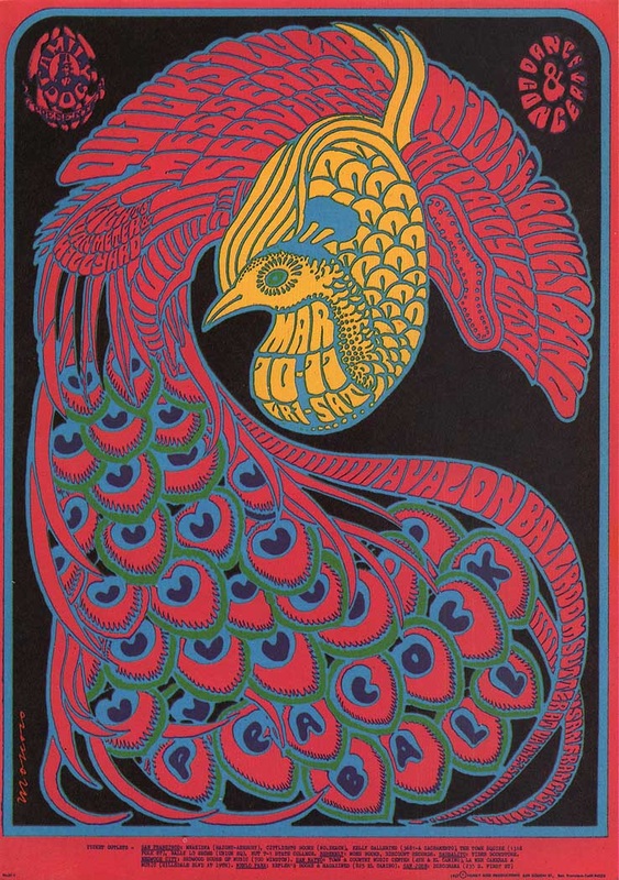
Risimie Yem
11/14/2013 12:30:14 am
Form, color, shape, patterns, contrast.
Kiona Smith
11/14/2013 03:18:18 am
For the element, this piece uses color. All of the various forms and shapes of the peacock heavily rely on color and use repetition of it. It has plenty of repetition with the color pink and blue and a few greens on the feathers of the peacock. It also uses contrast with the main center with the yellow/blue coloring. The words in its lower feathers I didn't notice initially until I looked over it again, which is a bit clever. It really blends in with the other feathers at first glance.
asher murphy
11/14/2013 03:22:42 am
Principles of Art: the reason why is because if you look at the pic then you will under stand why I said this.
kaily
11/14/2013 03:23:37 am
there is repetition in the colors and the feathers. there is pattern in the feathers, and the feathers colors. there is line in this piece like, everywhere you look pretty much. there is sort of a rhythm in the top of the feathers. Lastly there is movement in the photo, kind of.
jacob trump
11/14/2013 03:24:17 am
the contrast really stands out due to the black background and then brighter colors. the feathers are an example of rhythm. the two symbols in the top corners are alignment. it also uses limited colors (5 of them)
brandon
11/14/2013 03:25:06 am
this piece has form, shape, color, patterns and contrast and the yellow bird really grabs your attention when you look at the piece and there's also alignment in this piece if you look at the feathers you can see the words in wing of the bird
Yousef Zabarah
11/14/2013 03:25:19 am
color: there is unity of colors
Emme Chadwick
11/14/2013 03:25:27 am
Well, I think that a main element of art is color. There is a lot of bright colors in this picture. I also think that this piece has a lot of contrast. The bright colors contrast with the dark background. I didn't see the words in the beginning and then it started to take shape. Which I thought was an interesting technique by the artist. ...
Landon
11/14/2013 03:26:18 am
this piece uses a lot of color,but doesn't use much different color. this peice uses a form that flows. has many shapes of design.seems to be have textured its self.has many patterns, has a lot of movement,
Noah Gibson
11/14/2013 03:26:18 am
I see many different Elements and principles of art in this picture. One of these are reposition which is easily portrayed from the tail feathers on the bird. Contrast is another big one in this piece with all the bright colors, and then to contrast them is the black background. there's also a good balance between the background space and the space the object is taking up. Another one is Texture, which you can see on the ends of the feathers.
samantha brooker
11/14/2013 03:27:11 am
in this piece the person that designed this used all of the elements of art. including color, value, shape, space, line, and texture. along with theses elements of art, this artist used repetition, with the pink borders, and the middle shape. this artist also used contrast and alignment
Connor Wood
11/14/2013 03:27:43 am
This piece uses color really well with the limited color palette. The pink tail-feathers contrast really well with the yellow of the rest of the bird and the blue outline/stroke really helps to make it pop. The texture of the feathers being the text itself is creative and the way the text is aligned to the curves of the feathers is as well. Under the bird itself there's a good feel of repetition with the spade-shaped feathers that move your eyes downwards toward the name of the event itself. The green on those feathers adds a lot of emphasis to them. Overall, the space of the piece is almost entirely filled with the subject and the space that's still white (blackspace in this case) helps to start the flow of the whole piece (the space i'm talking about in specific is just to the right of the yellow of the bird).
Mikkel
11/14/2013 03:27:58 am
For pattern the peacock feathers are pretty much the same.For contrast the red and the green go perfectly together. For balance there is not a lot of any color. for line it has mostly curvy lines. And for color there is more then just 2-3 colors
Colby
11/14/2013 03:29:02 am
The pieces has a lot of color, but the colors are repetitive not a lot of new colors. the art flows together. There is movement and many patterns.
jose
11/14/2013 03:29:17 am
The piece has a lot of color in the peacock with yellow, pink, blue, green, and purple. It has shape of the peacock. The pattern in the feathers and words match. The contrast is really used well in this piece. This piece is really put together well.
Robert Powell
11/14/2013 04:19:14 am
you can fairly easily read everything and it all has a certain flow. the colors used really mix well and give it a happier feeling
Matthias A
11/14/2013 04:20:38 am
What I think stands out is the color, form, movement, and rhythm
Erik Safford
11/14/2013 04:21:25 am
This piece has a lot of color with the bright red and yellow. Theres a bunch of weird shaped letters within the actual bird adding a second later type effect. Also some nice contrast between the different parts of the bird. The same type of wavy-deformed text is repeated throughout the piece.
Tera V.
11/14/2013 04:21:58 am
I instantly saw Form, as most of the text isn't very noticeable until really looking at it. It took me a moment to see it.
becca v
11/14/2013 04:24:00 am
all of the principles of art, and elements of art. like repition, emphasis, color, value contrast, there is a bunch
Trent
11/14/2013 04:25:35 am
Repetition of color and texture play a large role.
Erik P
11/14/2013 04:25:54 am
Eben Jones
11/14/2013 04:26:12 am
It has lots of color. It has a bunch of space. Nice contrast. Lots of repetition. and smooth texture. ish
kyle kozisek
11/14/2013 04:27:55 am
color uses bright colors to show each part of the piece
Mason Channel
11/14/2013 04:28:20 am
their are a lot of colors in this piece . This piece has rhythm in the feathers. their is repetition in the colors. their is emphasis on the yellow peacock head. their is contrast in the yellow and pinkish color.
Evan Saraivanov
11/14/2013 04:28:41 am
there is rhythm in the feathers. there is also emphasis on the yellow peacock head. other than that yellow, the pink and blue are very repetitious. there is also a very good balance in negative(blue) and positive(pink, yellow and blue) space. also the yellow and pink contrast each other.
Andrew Moore
11/14/2013 04:29:05 am
This piece uses a lot of color and shape/forms. Not very much value or shading at all though. That's because if the letters or shapes had shade, you wouldn't be able to read the words.
Mikey
11/14/2013 04:29:19 am
I feel this piece used color, pattern, and repetition the best. Color because of how they all come together to make it really colorful, Pattern because most of it had blue in between spaces, and Repetition because there's a bunch of feathers that look the same.
Brian R
11/14/2013 04:29:32 am
What stands out the most to me is the color, pattern, lines, rhythm, and space. The color pops out because its really bright. The rhythm is what grabs my attention too because it follows through from the top of the picture to the bottom. The pattern that is within the picture makes it come out and grab you because its lines are all over the place. The lines is a huge part of this piece.
Trevor Wagner
11/14/2013 04:29:38 am
alignment- is in their because if u look at the feathers theirs a space of like 2mm
Hillary Cruz
11/14/2013 04:32:04 am
The strongest element of art would have to be, color. The color is a huge part of this piece for example all of the positive space is filled with bright vivid colors while the negative space is filled with black. This pieces strongest principle of art would have to be rhythm. rhythm is shown through out the feathers of the bird , this is rhythm because it creates movement and is very similar shapes and placement but it is not identical therefore making it rhythm. there are many other principles and elements of art and design but there were a few that stood out to me, for example line. line really stood out to me in this piece because line was used in many different ways through out this piece.
Michael Tran
11/14/2013 04:36:00 am
the shape of letter made up the peacock.It shaped up the structure of the bird.It require the audience to look closely to see what it said,i think it's an intention of the artist.The background make the bird brighten up the bird.The blue frame really helped distinct parts
Glenn Vera
11/14/2013 04:53:21 am
This piece uses a lot of Color, Shape & Line. The Colors used in the piece are are on a range from dark to light or cold to warm. They use lots of Shape & Line in the lettering and the design of the bird. The piece also has lots of Pattern & Rhythm. Patter & Rhythm is found in the colorway of the whole piece, and in the long feathers of the bird. The birds feathers also have a little movement to them.
Russ Q
11/14/2013 05:14:49 am
I see a lot of obvious color. There is a lot of typography and it's kind of hard to read. i like the way the piece uses form. The proximity of the words is done really good. Comments are closed.
|
Ms.TompkinsTeacher at EHS in Vancouver, WA. Drawing, Art Studio, Graphic Design and Yearbook. Archives
January 2014
|
 RSS Feed