|
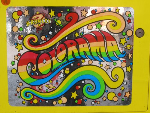
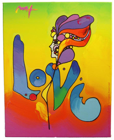
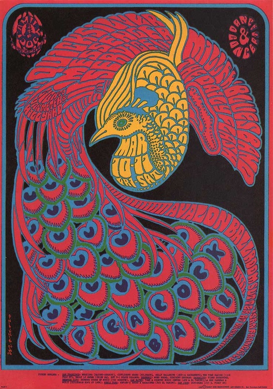
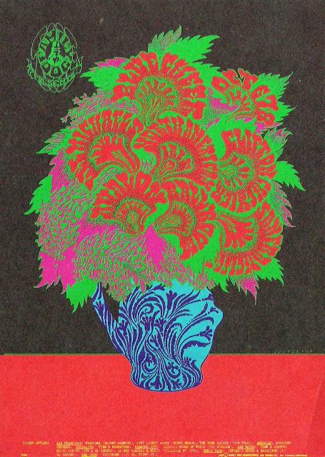
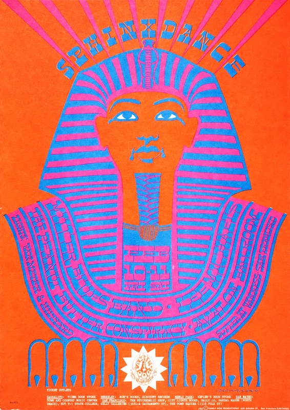
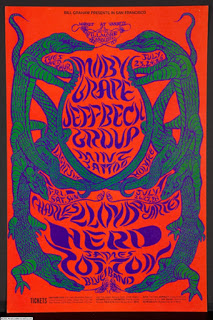
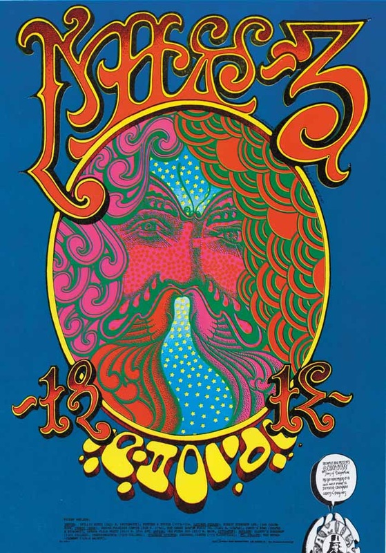
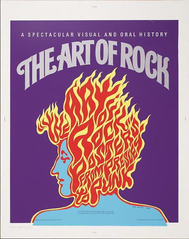
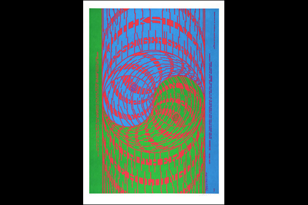
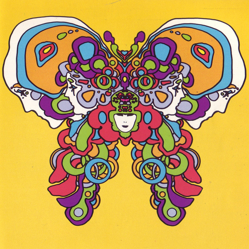
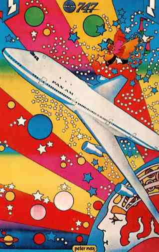
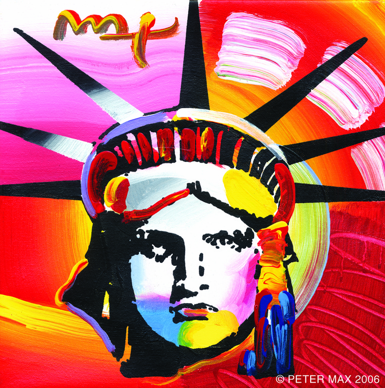
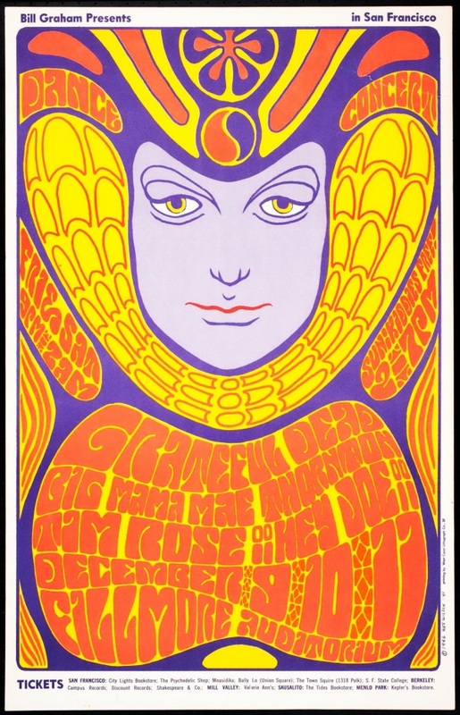
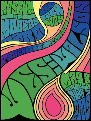
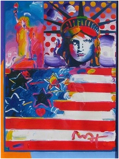
Look through the following images. These are all pieces created in the 1960s by artists who focused on the psychedelic art style. Using your own words, describe some common principles and elements that these pieces use. What do they have in common. What makes these fit into this style or genre... other than the time period? You can click on each one of these to see it larger.
asher murphy
11/18/2013 03:17:15 am
they take normal things and make it colorful and trippy.
Kiona Smith
11/18/2013 03:18:04 am
All of the pieces use a lot of color and repetition. They also use a lot of shape for the words used to give them this unique sort of look for that time period. They all use brighter colors, such as yellow, blue, green and pink and make it look kind of 'funky.'
Gavin Hawthorne
11/18/2013 03:20:46 am
Most of these use a lot of repetition and contrast of colours.
Noah Gibsonoa000
11/18/2013 03:21:10 am
Throughout the psychedelic art style, they use a lot of repitionon, Color, and shapes.
Mikkel
11/18/2013 03:22:16 am
They take random piece of art and transform it so it looks 10x better than it original was, and with some it adds color.
Connor Wood
11/18/2013 03:22:28 am
There seems to be a commonly occurring use of warmer colors, especially a gradient-type effect with some of them. There's hardly any sharp corners and the letters tend to conform with whatever shape need be. The thing that ties them all together, I think, is the mellow feel they all give off. Nothing I look at here feels aggressive.
brandon
11/18/2013 03:23:30 am
these pieces use color , contrast , and repetition a lot of them also use shape and words to create a funky image.
samantha
11/18/2013 03:24:28 am
they all have a certain alignment, and they're all colorful and they all stand out and most of them have patterns
Emme Chadwick
11/18/2013 03:24:52 am
I tihkn they have aton of right colors and they put a weird spin on the different objects, such as, the peacock, hair, faces, etc.
Jacob Trump
11/18/2013 03:24:59 am
rhythm and repetition. Contrast using bring colors for a trippy feeling/effect
Risimie Yem
11/18/2013 03:26:40 am
Color is for sure used in every single picture. Pictures are all have different meaning to it. Contrast is used aw well. The setting all feels like the same because they are all in the 60s. they all group together properly. Each design is creative and to the point. Really abstract and different kinds of patterns.
Yousef
11/18/2013 03:27:15 am
what I can see common in those pictures is the color the color ( also there are a lot of colors which means that they are colorful), in addition the font type is also the same !
jose
11/18/2013 03:27:52 am
All of the a lot of repetition and contrast. They all have color in it.
Tera V.
11/18/2013 04:18:26 am
Most of them use a bunch of repetition. Contrast can also be seen... But even though it isn't a principal, it seems that they really like using complimentary colors.
Cory Wiese
11/18/2013 04:18:53 am
The crazy ways the text goes, the next looks like it has some sort of motion
Evan Saraivanov
11/18/2013 04:20:46 am
all of them are very bright with a lot of colors. the most common colors are red yellow and orange.
Erik Safford
11/18/2013 04:20:54 am
Bright, contrasty colors that stand out. As well as some form of wavy bubble letters
Matthias
11/18/2013 04:21:49 am
They take normal things in life and then make then make them all weird and not normal for someone to see.
kyle kozisek
11/18/2013 04:22:18 am
they all are very colorful have curved lines and usually have word incorporated in the picture
Trent
11/18/2013 04:22:28 am
Lots of color, also most of them look drawn.
Jamie Gaylor
11/18/2013 04:22:47 am
They use very bright, contrastic, colors
Eben Jones
11/18/2013 04:22:47 am
Weird hippie colors. Letters that are bubbly and fat
Mason Channel
11/18/2013 04:22:59 am
all the pieces have bright colors. also they all have repetition. thy all have shapes too. they all group together properly.
Trevor wagner
11/18/2013 04:23:05 am
you can tell that these pic are form the 80s form the colorful words and the repetition of the font or color that is use in the art.
Roberto Carlos Luna
11/18/2013 04:23:18 am
Theres a lot of repetition and contrast of bright colors
Mikey
11/18/2013 04:23:40 am
All of these pieces use Color fantastically and twist the words or curve them to make them look cool and "Psychedelic"
Erik P
11/18/2013 04:25:17 am
Very Bright and colorful colors
Hillary Cruz
11/18/2013 04:25:22 am
All of these pieces have many things in common but the main thing that stood out to me the most would have to be the color. The color in every single one of them is a huge part of the piece and all the colors are very bright and vivid.
Russ Q
11/18/2013 04:26:12 am
They all have really bright vivid colors and contrast. lots of movement.
Andrew Moore
11/18/2013 04:26:24 am
They all have vivid colors and very obvious but altered shapes/forms. They also all obviously use a very bubbly and filling typography.
Brian R
11/18/2013 04:29:48 am
All these pictures have the vivid color.
Glenn Vera
11/18/2013 04:35:32 am
All these pieces share the Principles of Movement, Variety, Contrast, Harmony & Pattern and Rhythm. They all use a variety of colors that contrast each other and they all have a movement to them in the way their words are placed and designed. The Elements that all the pieces also have in common are Texture, Space, Shape, Color, Tone/Value & Line. Color is used a lot in all these pieces, the colors they use are on a big scale of warm to cold. They use line in almost everything in each piece, the line and shapes kinda helps express the texture of the things in all the pieces. Comments are closed.
|
Ms.TompkinsTeacher at EHS in Vancouver, WA. Drawing, Art Studio, Graphic Design and Yearbook. Archives
January 2014
|
 RSS Feed