|
Choose one of these pieces. Describe the piece. Give me at least 5 sentences. Use descriptive words, and vocabulary from the Elements & Principles. What do you see? What does it make you think of? How does it make you feel? What do you think the artist's intention was with this piece. What do you think they wanted the audience to see, feel and know. 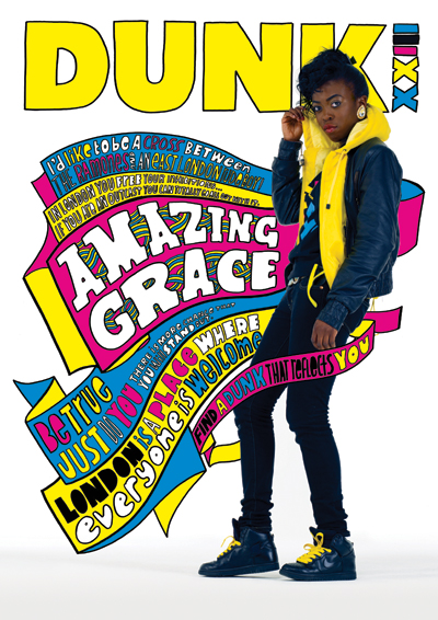 Kate Moross 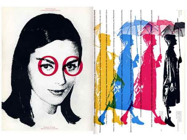 Bradbury Thompson 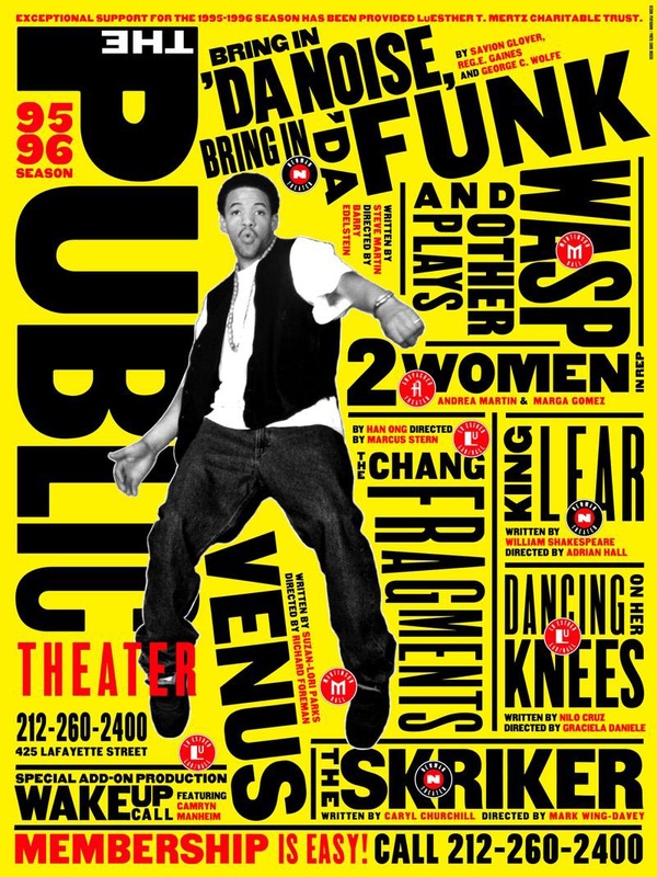 Paula Sher
Julion Oddy
11/6/2013 03:15:39 am
(Paula Sher's) The bottom picture shows a lot of consistency. By consistency I mean the colors have a harmony and repetition of Black, Yellow, and Red. The central focal point is the Man "Jumping" with the words around him. This piece of art reminds me of the early rap/ Funk genre of music from the 60, 70, and 80's. I overall love this piece and it is VERY well executed.
Kiona Smith
11/6/2013 03:16:48 am
Kate Moross's piece does a good job with creating a focal point, with the big chunk of text wrapped around the girl, along with 'Dunk.' It has a lot of repetition with the yellows, pinks and blues. The piece reminds me of something you'd see in a fashion/clothes magazine.
Yousef
11/6/2013 03:19:18 am
Bradbury Thompson
Emme Chadwick
11/6/2013 03:22:27 am
I picked the first picture. It has a lot of contrast going on and a lot of colors. It is very bright and big. It kinda has a funky feel to it. Its spunky and teenager orientated.
Landon
11/6/2013 03:24:18 am
Kate Moross
Gavin Hawthorne
11/6/2013 03:24:26 am
Bradbury Thompson's picture uses some repetition and colour. It somehow reminds me of the movie Marry Poppins because of the girl with the umbrella and clothing style. There is also some use of contrast.
jacob t
11/6/2013 03:24:32 am
kate moross
asher murphy
11/6/2013 03:27:09 am
All the pics have a rap vibe about them. The color chooses that they have is manly bright colors as well as colors that work well together. All of my thoughts are in the first two sentience and i can't think of anything else.
jose
11/6/2013 03:28:01 am
I see a lot of really bright colors. I also see a lot of contrast (black and white). All of the pieces really pop out. The artist intention to make it pop and catch your eye on the art. it makes interested into the pieces from the way it pops out with bright colors.
Mikkel
11/6/2013 03:28:13 am
i like the Paula Sher one because it brings out what a poster was like a couple of decades ago. i think the poster is mainly about the public theater that it shows about. the guy on it is most likely the host of it. I also like it because of the colors that were added. It look more like a add then a poster though. 11/6/2013 03:28:20 am
I picked the Paula Sher piece. I think the intention of it was to be loud, and I feel like it accomplished that. There's the constant use of the contrasting black and yellow all across the page, which makes the white pop on the gentleman in the center and the "The" in the title. There's the repetition of the typeface in that it is the same font but is constantly changing size, usually in the middle of the words in order to draw a flow through the words more easily. The way the alignment was done on the right half of the page with the different play titles brings your eye down it and gives you the gist of what genre of play the theater shows. It makes me feel a sense of funk or hip hop, which is in itself a strange contrast to theater.
Noah Gibson
11/6/2013 03:29:03 am
I chose Paula Sher's Picture. There are many reasons why I chose this one. One reason is because of how obvious the focal point is, I believe everything going towards the focal point kind of wraps the picture together. I also love the color selection she uses complementary colors (blue and yellow) she uses a shade that basically makes the color stand out even more, and she uses all 3 primary colors. This makes me think of an album cover, maybe for an artist that is more of a punkish poppy genre. I believe this picture also shows style, not only her clothing but how well the colors go on her clothing adds the extra "POP" to her fashion choice.
Noah Gibson
11/6/2013 03:29:38 am
Funk is the word I was thinking of for the type of music.
brandon
11/6/2013 03:29:32 am
I picked the first piece it has a lot of color in it and it also has a lot of contrast it really grabs your attention when you look at it because of all the colors.
samantha brooker
11/6/2013 03:30:10 am
I picked the top one, by Kate Moross. the elements I saw in this piece was a lot of color repletion, as she used the yellow to fill the word "dunk", shoelaces, coat, words, ect. kate also did the repeating shapes, making it more interesting to look at.
jose
11/6/2013 03:30:49 am
kaily
11/6/2013 03:31:11 am
1. I see a lot of color
Risimie yem
11/6/2013 03:36:09 am
What I see is that there's bunch of cmky printer colors used in these pictures. The first thing when I look at these pictures I think of movie cover and poster. I feel like the theme of these pictures is back In the 70s and 80s where everything is very colorful. I think the artist purpose was to make it look very attractive by using a bunch of words and colors. To be honest the words are pretty hard to read. But in the end I feel like the artist did a great job of getting our attention by making it look very catchy and attractive.
Cory Wiese
11/6/2013 04:23:26 am
First one.
Hillary Cruz
11/6/2013 04:23:36 am
The Kate Moross piece is very well done. I really like the way the colors contrast against one another. The different type faces she used also gave the piece contrast. The placement of the piece is really great I like how the scene is so busy but still has focal point. Overall this piece has many elements such as shape and space.
Tera V.
11/6/2013 04:24:39 am
I chose Kate Moross.
Erik Safford
11/6/2013 04:25:22 am
The yellow picture consistency with the repetition of black, red, and yellow. This picture gives me a kind of funky fresh vibe. The focal pint of the picture is the guy jumping. All of the different alignments of words keep things interesting. The picture engages the reader even more so by putting words sideways and upside down so the reader has to turn their head to read them properly.
Robert Powell
11/6/2013 04:25:29 am
I picked the first one, it uses a lot of bright colors to catch your eyes and bring your attention to the piece. the position the girl is in and what the pic displays to me is a 90s feeling vibe. it uses typography, and a lot of similar fonts or fonts that compliment each other.
Eben Jones
11/6/2013 04:25:53 am
I like the Bradbury Thompson one because is has repetition and pattern. Contrast of colors, and has lots of colors.
Mikey
11/6/2013 04:26:20 am
I chose the yellow one.
Matthias Ashburn
11/6/2013 04:27:18 am
Brian R
11/6/2013 04:27:26 am
When I see Bradbury thompsons photo I first get my attention at the pattern of herself walking with the umberella. I like the picture because its black and white with little color which is what I like to see. I believe her attention was to catch the viewers eyes on her eyes because of the way her eyes were circled which makes you look at that. I don't know what the picture is for but its artistic. The picture is of a girl.
Trent
11/6/2013 04:27:37 am
I'm picking the Kate Moross piece.
Evan Saraivanov
11/6/2013 04:27:58 am
paula sher.
Roberto Carlos Luna
11/6/2013 04:30:09 am
1. I see a lot of color
Andrew Moore
11/6/2013 04:30:15 am
Paula Sher - The artist was trying to convey a message of a very busy background showing that this artist has a lot of sound and is "fun". Using the correct adjectives in the design as welllll. Neon colors also attract the eye to the album for potential new listener's/buyers.
Jamie Gaylor
11/6/2013 04:31:38 am
It reminds me of the 1990's. They are very colorful and intriguing. I will say that they do not use simplicity. They all use the rule of thirds which is nice. There is also good pattern in a few of them. They were probably made by Leonardo Da Vinci.
Erik P
11/6/2013 04:34:17 am
I pick the first picture by kate moross , it has a lot of bright colors , and in the whole picture there are only 5 colors used , and I like how the text is wrapped around the girl , also the bright colors make it look more interesting.
Michael Tran
11/6/2013 04:34:29 am
1)contrast:black vs other bright color
kyle kozisek
11/6/2013 04:36:31 am
i picked kate moross
Trevor Wagner
11/6/2013 04:36:48 am
Kate Moross
Russ Q
11/6/2013 04:40:05 am
Bradbury Thompson- I like the way Thompson used Pattern with the women walking. Typography, is used well. He used Color well. You can see movement in the women walking. There are nice texture in the woman's face.
Mason Channel
11/6/2013 04:42:21 am
Paula Sher
Glenn Vera
11/6/2013 05:07:11 am
(Paula Sher) This piece is very straightforward and dramatic with how they chose to make the words and what font they used but the placement of the words is kinda bizarre/awkward. They also use a lot of repetition and rhythm with the placement and look of the lettering. When I look at this I see big bold statements and a bright background, those are the things that caught my eyes first but when I take a closer look I see the smaller lettering and detail they put in the alinement of the words. This piece makes me think of some sort of big show that is in town because of the way they make the words pop out and excite me. I think that the artist was trying to make something that would catch your eye really fast and keep you looking by having the detail in it. The artist wanted the audience to see all the things they had to offer. The feeling I think the artist wanted for the audience is excited/active. The artist wanted us to know that even though this piece is kinda messy in a way it still catches people's attention.
becca v
11/14/2013 04:30:45 am
there is some contrast in it, definitely some movement shown, color
Colby
11/26/2013 03:21:42 am
Paul Sher Comments are closed.
|
Ms.TompkinsTeacher at EHS in Vancouver, WA. Drawing, Art Studio, Graphic Design and Yearbook. Archives
January 2014
|
 RSS Feed