|
Take a look at this piece. In your own words (Don't read other people's comments before typing!!!!), Tell me what elements and principles of art this piece is using the most strongly. Give me at least five sentences to describe it. Elements of Art: value, color, form, shape, space, line, texture Principles of Art: emphasis, pattern, balance, unity, movement, contrast, rhythm Design Principles: contrast, proximity, repetition, alignment 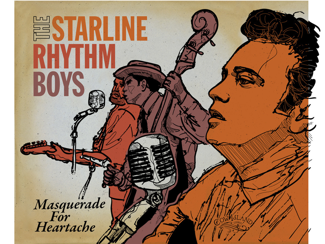
Julion Oddy
11/7/2013 03:14:10 am
The Alignment of the pictures work well with the harmony of Colors. the emphasis of the microphone Also brings out how this is a Music Album. The wording and font all have a consistency of Shape, size, and Font! The Rhythm of Colors and placement of the people are superb! This is truly a great album cover and shows nearly all of the principles, elements, and Design principles.
asher murphy
11/7/2013 03:20:58 am
Principles of Art: the reason why i think that it is this is because this is what was speaking to me as I looked at the piace
samantha brooker
11/7/2013 03:22:16 am
this piece uses color repetition majority. along with space, and also shape repetition.
Kiona Smith
11/7/2013 03:24:26 am
The element of art most strongly used in this piece is color. It makes the men stand out against the background and emphasizes them more. Line is also used strongly as well to give them a bit more detail. There is a repetition with colors. The orange, red and pink(?) color also corresponds with the title of the piece and works well together. The space between them is also another principle used strongly.
Emme Chadwick
11/7/2013 03:25:03 am
This particular artwork has a lot of form. It doesn't have too much color, but with the colors the artist use, it makes it look really good. You can tell that the 2 further away people are singing and most likely dancing to their music.
kaily
11/7/2013 03:25:16 am
line, texture. space ,colormovement
Jacob
11/7/2013 03:25:39 am
the texture gives it a sketch look. the alignment of the title/words. limited color scheme and contrast. the value is dark. only dark colors
brandon
11/7/2013 03:26:13 am
there's a lot of colors that grab your attention and a lot of lines in this piece that go nicely with the texture .
Yousef Zabarah
11/7/2013 03:26:24 am
I think texture is used a lot in that photo, also contrast between some of the colors ( black and white ) ,also there is alignment in the photo first the name of the band which is more important that the name of the album.
Noah Gibson
11/7/2013 03:27:05 am
There are many Elements and principles of art in this design. Repetition is one of them, repetition of the colors and repetition through the style of art in this photo. Line is another element of art in this photo you can see many of them, straight, curved, it looks like it was sketched. Also there is really good balance in this picture as well, perfect amount of color, perfect amount of text. And the contrast stands out pretty well in this photo also, with all the light colors, and the black to even it out.
jose
11/7/2013 03:27:33 am
This piece uses color to make it pop. it also uses repetition. it uses line and shape. it has some contrast. the piece has aliment to.
Landon
11/7/2013 03:30:32 am
the color is strong, along with the shape is strong. i can see the shaping which can give depth. the form of this piece gives it a more wooden look.there isnt much movment in this piece it kinda looks frozen.i find this boring.
Connor Wood
11/7/2013 03:31:37 am
I think some of the more strong elements it's using are color with the limited color palette, and lines and texture with the actual figures of the gentlemen. The way the shadows are drawn with the straight lines is repeated throughout. In terms of design principles, the text is aligned to the left side leaving good space for the rest of the art. The placement of the guy on the far right really gives a sense of depth to the whole thing, which has a rhythm that drags you through left to the text.
Risimie Yem
11/7/2013 03:32:31 am
elements of art- Uses value and texture, it feels like this picture fits with a country type of theme. The colors and patterns all match. It makes the poster look very attractive.
Cory Wiese
11/7/2013 04:20:53 am
I see the color is well done and it is not hard to look at. Also there is alignment in the name of the song. There is texture in the background color. Also the emphasis and color of the 3 men compliment each other
Tera V.
11/7/2013 04:21:00 am
The color around this piece is very warm, as it is usually phased around the colors red, yellow or orange. The texture is similar olden paper.
Trent
11/7/2013 04:21:39 am
Repetition of the color and style of "scratchy" art
Erik Safford
11/7/2013 04:22:01 am
The band name has nice alignment. The rhythm of the words works well with the colors of the people. There is also repetition in the colors. There is some nice contrast between the white microphones and the colored people and the white background.
kyle kozisek
11/7/2013 04:23:38 am
color line alignment
Robert Powell
11/7/2013 04:24:23 am
it uses light contrast between colors, they all compliment eachother and work well in the piece. it uses texture to make the people look a little more realistic, and everything seems to be moving in the same direction. it also uses a lot of different shapes in the piece. it uses typography aswell
Michael Tran
11/7/2013 04:25:25 am
Elements of Art:the elements in the picture use pretty much same color but different value
Andrew Moore
11/7/2013 04:26:13 am
The poster uses color, lines, form, shapes, and much emphasis. The colors are well chosen because they are all near each other on the color wheel. Forms and shapes are used by making people, microphones, and even the lettering.
Trevor Wagner
11/7/2013 04:27:00 am
In this peace of art I see texture, shape, color, value, line, repetition, theme, some pattern,
Jamie Gaylor
11/7/2013 04:27:19 am
It uses value and texture, it has a 1950's rock theme in my eyes.
Brian R
11/7/2013 04:27:46 am
One element of art that really stands out is the color. The color makes the people stand out from the background making it pop. One principle that stands out is rhythm. I see the rhythm where the guys are singing and is like a pattern but theyre not exact. I like this piece because it stands out and is neat.
Roberto Carlos Luna
11/7/2013 04:27:52 am
here's a lot of colors,lot of lines in this piece that go nicely with the texture
HILLARY CRUZ
11/7/2013 04:28:41 am
This piece has many of the principles of art such as emphasis with size. This piece also has some rhythm in the way the guys are drawn and placed. The elements of art that mostly stood out to me would have to be texture and color. This piece also has many design principles such as alignment with the text. another principle of design would have to be contrast with a light vs. dark pallet.
Mikey
11/7/2013 04:28:47 am
I think the piece strongly uses Line, Emphasis, and Alignment. I think it uses Line strongly because it uses different kinds for the hair, microphone, shirts, shading, and etc. I think it also uses Emphasis strongly because the background is half white and half light brown while the guys are colored and in the middle making them stand out. I think in addition it strongly uses Alignment because the guys are lined up diagonally nicely.
Eben Jones
11/7/2013 04:29:03 am
The Color is pretty. It has a nice variety of colors. It has a smooth texture. The contrast is noticeable. And it has a fancy pattern.
kyle kozisek
11/7/2013 04:29:24 am
line- most all the borders and detail are lines with various thicknesses
Evan Saraivanov
11/7/2013 04:29:43 am
this piece has good balance. you can also see that the hair and shirts are textured. the picture is unified, nothing is more important. there are many lines. there is good value.
Mason Channel
11/7/2013 04:33:39 am
there is a lot of texture on the men . also there a lot of shapes in tis piece. there is rythym in the mans neck and the mans hat. there are multiple examples of repetition like the color and line exedra. also the words are aligned left
Russ Q
11/7/2013 04:33:58 am
This piece uses line well in the way that the people and instruments. color is used in the people. Texture in the people and the background. Left aligned.
Glenn Vera
11/7/2013 04:34:35 am
An element of art I think this piece uses strongly is line. They use line in the design of the microphones and the three men in the image. They used pattern with the color way of the three men and the words. They use left alignment in the name of the band. On the microphones and on the hair of the orange man there is lots of texture.
Erik P
11/7/2013 04:36:23 am
the element of art used in this piece is color It makes the men stand out against the background , The space between them is also another principle used , I can see some movement in here , it uses texture to make the people look a little more realistic , also the colors of band group name matches the colors of the people
becca v
11/14/2013 04:29:05 am
it strongly uses line, there is very good texture in the people and in background, definitely shows the movement especially using the textures in the people. Comments are closed.
|
Ms.TompkinsTeacher at EHS in Vancouver, WA. Drawing, Art Studio, Graphic Design and Yearbook. Archives
January 2014
|
 RSS Feed